

Website redesign
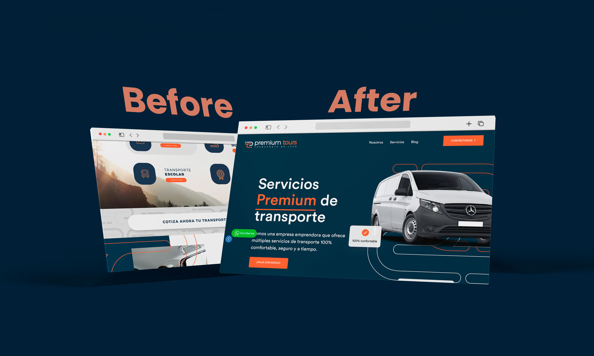
Helistar is an air transport services company that offers its users the possibility of contacting them directly through its website. The original design lacked an attractive design that would provide a good experience to the end user and also its content did not provide them with organic positioning, much less clarify the doubts of the users who entered the portal; Based on this problem, our company gave this website a growth opportunity that would attract a greater number of potential clients and who would also feel the peace of mind of acquiring their services by knowing each one of them before hiring them.
Initially, the platform showed a design poorly adjusted to the brand's tone of voice, followed by low-quality images and highly technical information that prevented the common user from understanding the message. The visual structure of the page was not comfortable because I presented you with a large amount of text together and this, in addition to boring the reader, makes him get lost while reading.
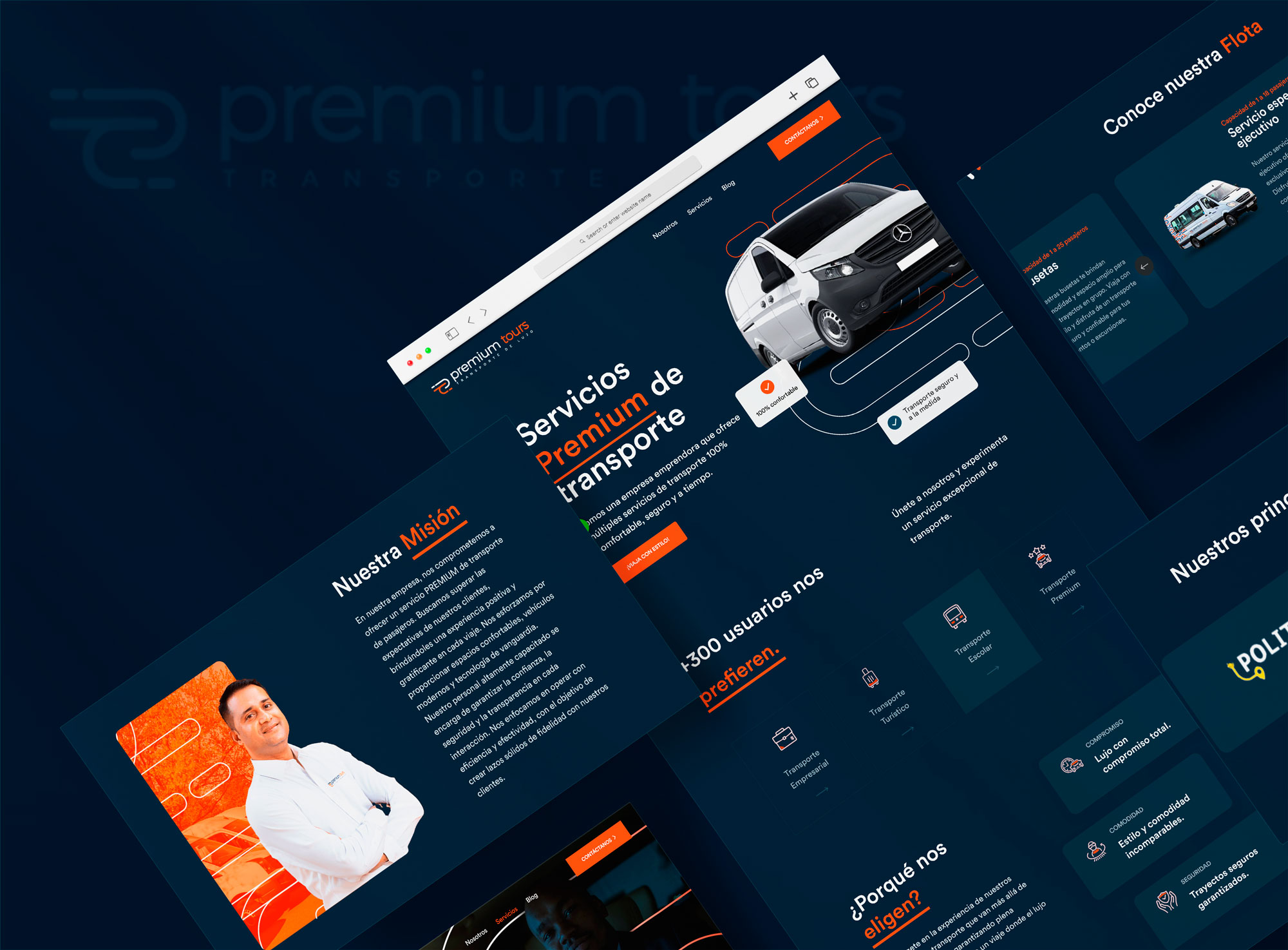
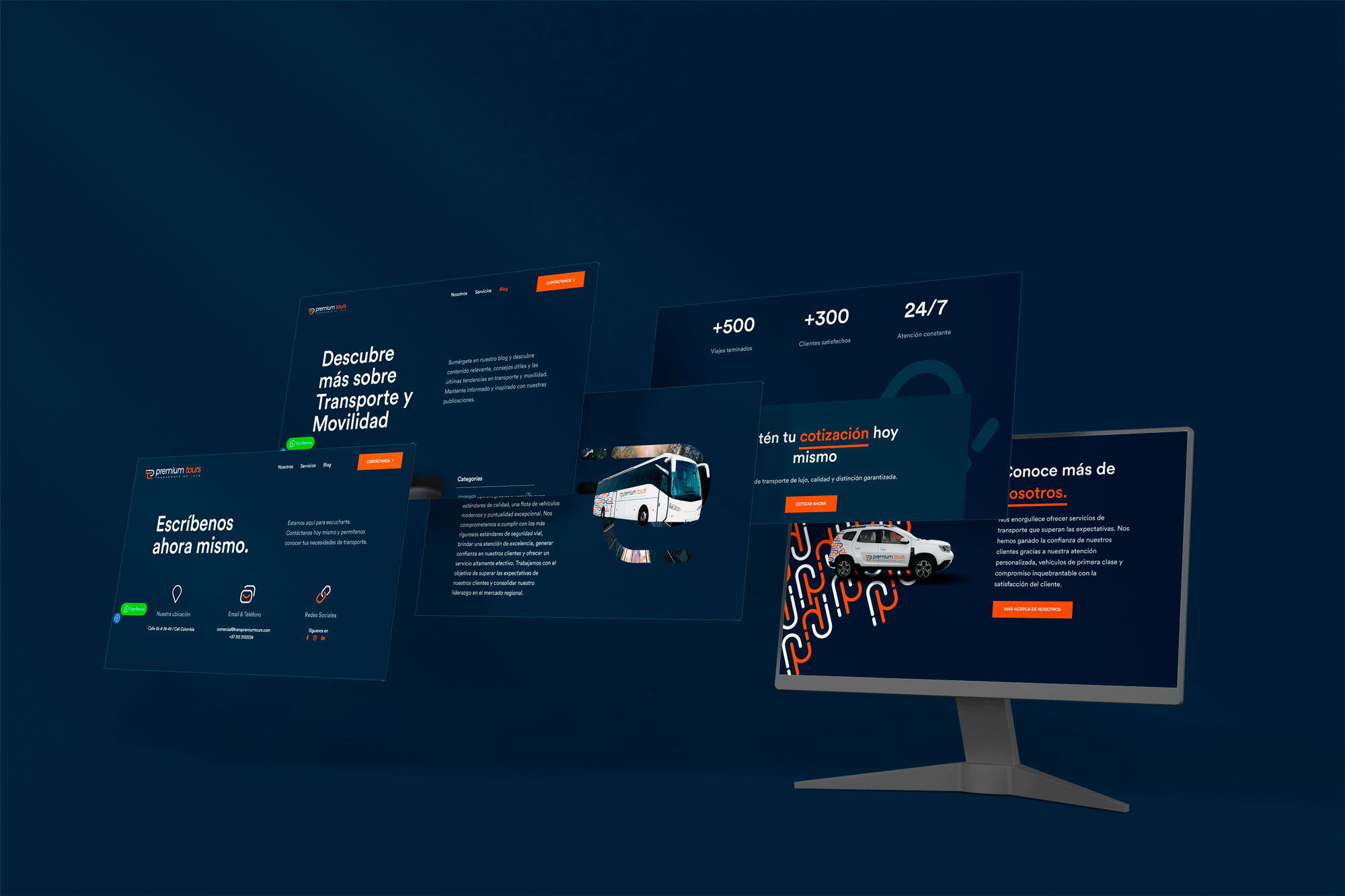
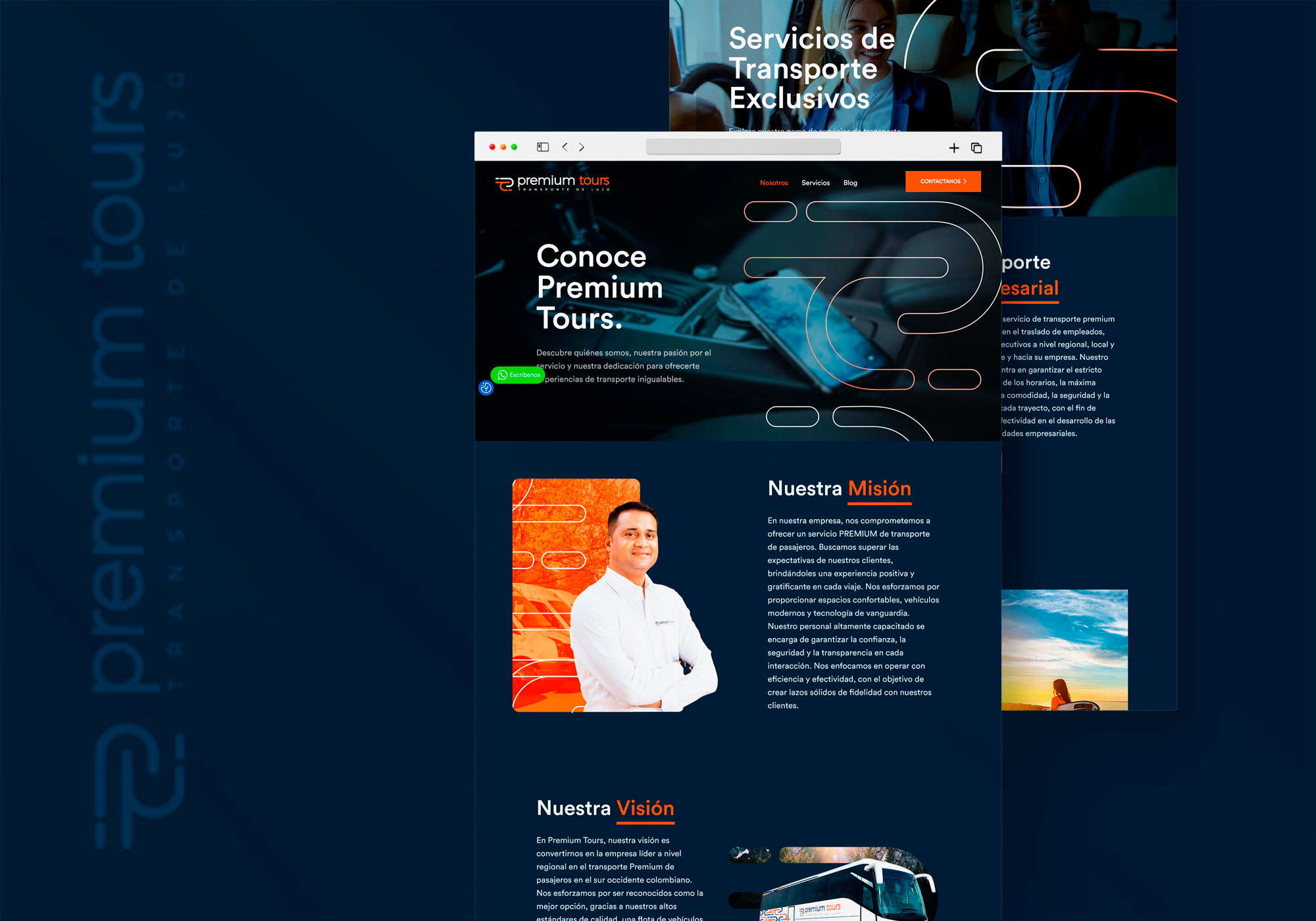
With the redesign that we provided, it was possible to give it a greater visual appeal, enhancing at first glance the luxury VIP air transport service with a CTA to make your flight reservation, then the company's services are shown and later we find the aircraft of which you can see their technical sheet by clicking on the one of your preference.
Summery
Helistar is a highly recognized company, which has worked with well-known clients or famous personalities, which is why the need to give its portal a greater style that fits the brand and that everyone who enters the web feel satisfied when obtaining all the relevant information of the company and of course the interest of the user.
